Evolution Of Google Search
The origins of Google are well documented. Larry Page and Sergey Brin, two computer science graduate students, met at Stanford in 1995 and created what would become one of the most useful inventions of all-time — a highly usable and accurate internet search engine. Let’s examine the visual history of the platform.

Larry and Sergey in the garage they used as a makeshift office (1998)
Source: Google
Backrub (1996)
Their effort started off as a project hosted on Stanford servers called BackRub, so named since the system checked back-links to determine a site’s credibility. Within about a year, it quickly grew popular enough to warrant its own hosting and infrastructure outside of Stanford. An early project paper from 1997 is an interesting read and boldly predicted that "top search engines will handle hundreds of millions of queries per day by the year 2000." There aren't many screenshots of BackRub. If you have more, please contact us to help document this.

Backrub homepage (1996)
Source: blogoscoped.com
Early Stage Google (1997)
Google.com was registered on September 15th, 1997, and work began to port things over from BackRub to the new domain. Google the company did not yet exist, but the official domain name and very early branding allowed them to construct the first versions of Google as we know it today.

Google in its earliest alpha stage. (1997)
Source: Nicholas Jenkins/Stanford

Google search results in alpha stage (1997)
Source: blogoscoped.com
Google! Has An Exclamation Point (1998)
Google’s branding began to take form, progressing from the wacky older logo above (and others) into a design created by Sergey Brin in the open source image editor GIMP. This logo showcased the hallmark primary color scheme still very much in use today. But naturally, the exclamation point at the end sticks out like a sore thumb. It seems trite now, but surely Google at the time was inspired by their fellow Bay area internet pioneers at Yahoo!. In addition, the “I’m feeling lucky” button is added, which automatically redirects the user’s browser to the first search result when pressed. Though the button still exists, it’s essentially just for show with the transition to Google Instant in 2010.

Google Beta homepage (1998)
Source: Wikipedia

Google homepage in its formative stages (1998)
Source: Imgur

Google Beta homepage (1998)
Source: India.com
First Google Doodle (1998)
Google’s excellent corporate history page documents the first Google “doodle” — a playful, decorative version of the now iconic logo — as an homage to the Burning Man festival which the founders were attending at the time. Larry, Sergey, and future CEO Eric Schmidt had been known to attend Burning Man on multiple occasions. Google maintains an authoritative, comprehensive site for its Google doodle art, with over 1,000 doodles creates to date for Google domains around the world.

The first google doodle, referencing the Burning Man festival (1998)
Source: Google
A Simple Search Page (1999)
Google transitioned from a homepage with many links into a simplified search box without the cruft. Google’s intense focus on search utility without expanding to a full "portal" was the opposite of the norm at the time for internet giants.

Google search (1999)
Source: web.archive.org
Ruth Kedar Logo Redesign (1999)
Google transitioned to the modern foundation of the logo based on the Catull font on May 31, 1999. Ruth Kedar was hired by the founders to create a simple, playful, approachable design. In an interview with Israeli newspaper Haaretz, Kedar stated that “from the outset, it was clear to us that the name of company had to stand at the center of the logo. It must be remembered that at the time, many people were afraid to use the Internet, and it was important to broadcast something user-friendly both on the home page and in the logo. Something simple, that you didn’t need to be scared of, something catchy and full of life.”

Google Logo (1999)
Source: logos.wikia.com
The First April Fool's Day Joke, More Languages, and Marketing Messages (2000)
Google's homepage underwent significant changes in the year 2000. The company's focus on hiring was evident with the addition of a "Jobs@Google" link in the top right of the screen. The area underneath the search box also became a more centralized area for marketing and news messages. Plus, Google truly became a global presence with the addition of 10 languages other than English. Note the world map behind the Google logo. And in what would become a tradition, Google embraced April Fool's Day with a prank homepage, it's first ever. In fact, a version of the original April Fool's page still is available on Google today!

First Google April Fool's joke (2000)
Source: eweek.com

Google search homepage, with language options and world map (2000)
Source: blogoscoped.com
Ads Launched (2000)
A contextually relevant advertising product named Adwords became Google's cash cow after it was launched on October 23, 2000. Experimentation in the look and feel of the ads was rampant for the first few years as the company honed in on the most successful way to display the ads for both users and advertisers.

First Google search ads (2000)
Source: Advia.com

First Google search ads (2000)
Source: Advia.com

Adwords ads in Google search results (2001)
Source: Advia.com

Adwords ads in Google search results (2002)
Source: Advia.com

Adwords ads in Google search results (2003)
Source: Advia.com
Google on September 11, 2001
On the day of the 9/11 terrorist attacks in New York City, Google for the first time used the homepage as a way to disseminate information in the time of crisis. Prominent headlines linked to the Washington Post and the cached version of CNN.com. The content changed throughout the day as new information became available. Google would later expand its usefulness in emergencies with the Person Finder feature for areas hit by tsunamis, earthquakes, and other disasters.

Google Search on 9/11 (2001)
Source: Advia.com
Tabs (2001)
Google added the number of web pages in its search index to the homepage, a number that steadily grew over time until it was removed in 2006. A tabbed interface was introduced on top of the search bar to showcase the ability to search the web, images, groups, or directories.

Google homepage with tabbed interface (2001)
Source: web.archive.org
Froogle (2002)
The playfully-named product search and shopping engine Froogle was launched in December 2002. A play on the words frugal and Google, it allowed users to focus specifically on commercial searches for tangible goods. It was retired in 2007 and rebranded as Google Product Search.

Froogle homepage (2003)
Source: web.archive.org

Froogle search results (2003)
Source: chefintrainingwallpaper
iGoogle: The Personalized Google Homepage (2005)
Google Personalized homepage, later known as iGoogle, launched in May 2005. iGoogle allowed users to add various "gadgets" to the homepage, which were small components of content that served a specific purpose -- such as a displaying a clock, calendar, and the weather. In 2007, iGoogle added highly creative themes, many of which changed throughout the day. iGoogle was shut down in November 2013.
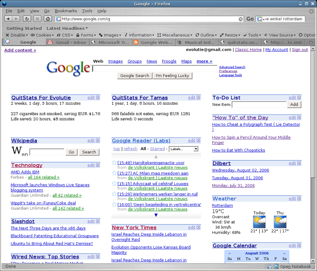
iGoogle homepage (2006)
Source: evolutie.org

iGoogle Gadget Gallery (2006)
Source: softonic.com

iGoogle themed homepage - Switzerland (2007)
Source: munz.li
Universal Search (2007)
Universal search combined the many separate elements of the Google search experience into the main search results page. With this improvement, different types of results such as images, videos, news, books, patents, and more would populate for a given search -- without the user having to resort to separate searches in Image Search, Video Search, Book Search, etc.

Google universal search, showing results from the web, images, news, and videos (2007)
Source: marketingpilgrim.com

Google universal search, showing results from the web, news, and videos (2007)
Source: googlesystem.blogspot.com
Google Suggest (2008)
Google Suggest started off as a test product in the now-defunct Google Labs. (Labs was a part of Google's site that showcased experimental and novel features for public consumption. Some of these experiments made it into real Google products, and others were discarded.) In August 2008, Google Suggest was promoted out of Labs and launched to the masses, allowing potential search terms to magically fill-in in anticipation of what the user typed. This feature provides a lens into the universe of search terms people type in, and thus, has inspired several books. Google Suggest was a precursor to Google Instant, launched in 2010.

Google Suggest results (2008)
Source: imboy.wordpress.com
Sidebar (2010)
In 2010, Google moved the links to access different types of search results to the left side of the page. The left-hand navigation aimed to take advantage of computer screens that had gotten wider over time and had empty space along the left and right borders. The sidebar was later abandoned.

Google search results with sidebar (2010)
Source: blogspot.com

Google Image Search results with sidebar (2010)
Source: blogspot.com
Google Instant (2010)
In an effort to improve the speed and efficiency of the overall search experience, Google rolled out a controversial search enhancement called Google Instant. Google Instant took the concept of Google Suggest to an extreme by not only suggesting search keywords as you typed your query, but by changing the search results themselves in real-time too. It's difficult to describe the feature on paper; a video does it justice. Here's a demo during the Google Instant launch event. This feature was turned off in 2017.
Google Redesign (2011)
Sweeping changes in the design of the homepage and search results took place in 2011. In fact, the changes were made across several flagship Google properties, such as Maps and GMail. According to Google, the change brought improvement to focus (getting what you want quickly), elasticity (usability on both desktop and mobile devices) and effortlessness (combining power with simplicity).

Google homepage redesign (2011)
Source: Google Blog

Google search results redesign (2011)
Source: Google Search Blog
Knowledge Graph and Knowledge Panels (2012)
Google announced their Knowledge Graph project in 2012 via a blog post. Aiming to augment the search experience, the knowledge graph is a huge database of "objects" that people might search for, such as people, places, and things. At launch, it contained 500 million objects, and has grown dramatically since then. Visually, the Knowledge Graph is most evident when it appears as a "Knowledge Panel" on the right side of the screen. Later in 2012, Google added the "Knowledge Carousel" at the top of the page for certain types of searches.

Knowledge graph panel for Matt Groening (2012)
Source: Google Blog

Knowledge graph carousel for Aamir Khan (2012)
Source: Google Blog
New Google Logo (2015)
One month after reorganizing their corporate structure and creating a parent company called Alphabet, a striking visual change to the Google logo was made. They authored their own typeface called Product Sans -- a modern, geometric, sans-serif font.

Google's redesigned logo (2015)
Source: Wikipedia
Clean Homepage (2018)
In 2018, Google's homepage is clean and simple. The homepage has appeared mostly the same since 2011, except for the new logo.
Round Textbox (2019)
The 2019 homepage has a rounded-corner textbox as the search entry field.
Please help support our museum hosting costs by making a small donation -- buy us a coffee! Thank you so much!
 Buy us a coffee!
Scroll up to the top.

