Check out our YouTube video showing the history of the Amazon.com website! It has all the images and captions from this page, and is easy on the eyes.
Early Stage Amazon (1994-1995)
In 1994, Jeff Bezos witnessed the exponential growth of the World Wide Web and saw an opportunity to realize online commerce. Initially named Cadabra, Bezos changed the name when his attorney convinced him that it sounded too much like Cadaver. Bezos also considered the name Relentless for a while before opting for Amazon, which reflected the ideas of grandiosity and abundance. The company was founded on July 5th, 1994.

Jeff Bezos (1997)
Source: CNBC Video
Original Amazon Website (1995)
Amazon.com was launched in July 1995. The logo was an abstract letter 'A' with a winding river flowing through it and the words Amazon.com, Earth’s biggest bookstore at the bottom. The color scheme of the site was typical for 1995 -- lots of gray and not terribly vibrant.
The company offered more than 1 million book titles, vastly outpacing any competition at the time. It featured a simple search engine to help find relevant books. Amazon also offered a free subscription to its personal notification service called "Eyes and Editors," enabling clients to proclaim their favorite authors and books. Whenever a new book of interest was added to the catalog, Amazon would automatically send the customer an email announcing the addition. Additionally, Amazon allowed clients to comment on books and exchange ideas with people around the world using review pages.

The original Amazon website (August 1995)
Source: Restored by Taran Van Hemert
TV Interview Footage (1997)
Amazon founder Jeff Bezos conducted many interviews in the early years,
but this one in 1997 with KIRO 7 Seattle
is notable because it had footage of the website at the time. The quality
is poor, but still valuable to see Amazon in it's infancy. The computer in the closeup
shots of the website appears to be an
Apple Powerbook 1400,
but the PC brand on Bezos' desk is unclear.
The first image below makes light of Amazon's massive collection of more than one million
books. Amazon's Book of the Day link boasts "a different title every day
for the next 3,000 years."

Amazon.com Homepage on TV broadcast (1997)
Source: KIRO 7 News

Amazon.com Search by Title, Author, or Subject (1997)
Source: KIRO 7 News

Jeff Bezos with Amazon.com (1997)
Source: KIRO 7 News
Logo Experimentation (1997)
The initial Amazon logo underwent several iterations, with changes in color scheme and fonts. With each iteration, the logo slowly came into shape, with the color palette becoming increasingly similar to the modern logo.

Amazon experiments with logo iterations (1997)
Source: fineprintart.com
Early Amazon Homepage (1997)
The company went public on May 15th, 1997 and raised $54 million in the process. Amazon's website underwent major changes, reflected in the design and more user-friendly interface. A left sidebar was introduced to enhance navigation, making the website more usable. Book covers and reviews were introduced to the experience to allow users to visualize the bookstore.

Amazon homepage image, restored by Version Museum (1997)
Source: ebaumsworld.com
Additional Logo Changes (1998)
In 1998, the Amazon logo went through additional iterations. A lowercase serif font served as the main logo for a short time, with the tag line "Earth's Biggest Bookstore" underneath. But later that year, the company employed a sans serif all-caps logo with a bright yellow letter 'O' in the middle. This was also taken down in a few months; the logo soon morphed into the more familiar lowercase sans-serif logo with a slightly curved yellow line underneath. The motto "Books, Music and More" floated above. With Amazon's ambitious expansion plans, the slogan was taken out after a couple of months.

Early Amazon logos (1998)
Source: fineprintart.com

Homepage with "Earth's Biggest Bookstore" slogan (1998)
Source: blog.cake.hr
Introduction of Tabs & International Expansion (1998)
As Amazon's ambitions grew beyond selling books, tabs were introduced to the website. The site itself went through numerous alterations, with the search bar making its first prominent appearance to the top left of the homepage in the latter half of the year.
Furthermore, international expansion began, with acquisitions of online stores in the United Kingdom and Germany.
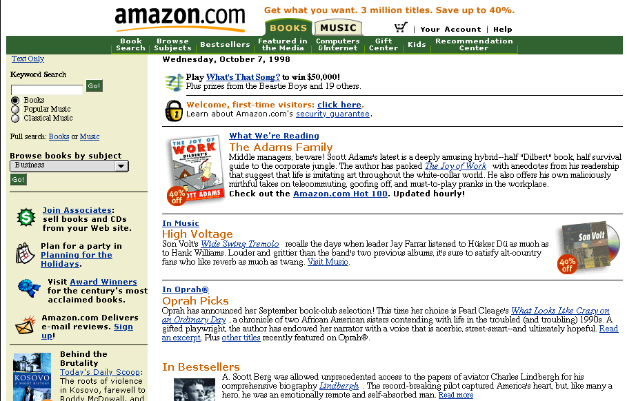
Tabs introduced (1998)
Source: nist.gov

Oprah's Book Club (1998)
Source: nist.gov

Amazon.de homepage (1998)
Source: presseportal.de
Product Expansion, Zshops, and Auctions (1999)
The use of tabbed navigation became more practical when toys, games, electronics, and auctions launched to shoppers as part of Amazon's hunger to expand service lines. A right sidebar was also added.
A market for third party sellers to showcase their products on Amazon was created, called zShops. Eventually, this evolved to become the Amazon Marketplace in 2000.
Amazon also experimented with Auctions in this timeframe, which later shut down in 2002.
Amazon homepage (1999)
Source: makeuseof.com

Amazon product page (2000)
Source: wordpress.com
The Modern Amazon Logo With a Smile (2000)
Design agency Turner Duckworth created the now-iconic logo for Amazon in the year 2000 with a custom typeface. Cleverly, designer Anthony Biles devised a smile that connects the letters A and Z. Jeff Bezos wanted something produced quickly, without the typical market research and focus group feedback process. Reportedly, Bezos jokingly claimed "Anybody who doesn’t like that logo doesn’t like puppies!"

Amazon Logo (2000)
Source: imgur.com

Amazon Letter A Logo (2000)
Source: vmastoryboard.com
Tab Insanity (2000)
As Amazon's catalog diversified to include categories such as art, kitchen, lawn & patio, tools, and beauty, the tabs expanded in turn -- sometimes to a comical degree. Luke Wroblewski documented this in his excellent piece on the history of Amazon’s tab navigation.

Amazon homepage with 15 tabs (2000)
Source: humanfactorsblog.org

Amazon tab layouts (2000)
Source: lukew.com
Tabs Refined (2001-2003)
Amazon added additional categories such as eBooks, baby items, cell phones, and video games. With the growing number of product categories, the tabs couldn't grow infinitely to keep pace with the limited real estate in the top navigation area. The tabs were reined in and the categories were moved to the left sidebar area. The Amazon logo decreased in size to accommodate the changes.
In 2002 Amazon experimented with a limited number of prominent tabs at the top again, and added some graphic flair in the form of a shirt to announce the arrival of the apparel store. Additionally, Amazon began offering Gold Box deals, showcasing the best deals on the site.

Tabs moved to left sidebar (2001)
Source: the-digital-reader.com

Tabs return (2002)
Source: medium.com

Product page (2002)
Source: 37signals.com
Streamlined (2005)
The on-again off-again relationship with tabs continued, but this time they were severely curtailed. There were only tabs for the homepage, a personalized page of products called Your Store, and a link to all the product categories.
Amazon Prime began in February 2005, and prominent ads for the service were plastered on the homepage.
Interestingly, the category page that lists 30+ types of products also has some logos, that in retrospect, are fascinating to see. Amazon used to power the websites for Toys-R-Us, Babies-R-Us, and Target. Toys-R-Us and Babies-R-Us ended up going bankrupt, closing all their US and British stores in 2018. Target and Amazon are now fierce competitors in the retail sector. But back in 2005, online retail was a small slice of the pie and wasn't strategic enough for these companies to own themselves.

Amazon homepage (2005)
Source: archive.org

Amazon product categories with Toys-R-Us and Target (2005)
Source: archive.org
Tabs Begone! (2008)
The tab structure was completely discontinued in favor of the left sidebar. The site embraced a blue and orange color scheme, complementing the orange from the smile in the logo.
The Kindle ebook reader launched in 2007, and Amazon used the most valuable space in all of retail -- its own homepage -- to market the product to potential buyers. In the image displayed below, Jeff Bezos celebrates the fact that Kindle is back in stock and invites customers to view the Amazon shareholder letter to understand the product roadmap. This really illustrates the relationship Bezos' attempted to cultivate with Amazon users.

Amazon homepage with Kindle ad (2008)
Source: archive.org
iPods and Blackberries (2009)
Design-wise, 2009 didn't see many changes. But in a museum like ours, who doesn't like to see old favorites like iPods and Blackberry phones? These classics were still huge sellers in 2009. The iPhone came out in June 2007 and was still in its infancy. The first Android device, the T-Mobile G1/HTC Dream, was launched in September 2008.

Amazon homepage with iPods and Blackberries (2009)
Source: archive.org

Amazon Blackberry Bold 9000 product page (2009)
Source: archive.org
Colorless Redesign (2012)
With a totally updated look, Amazon dropped almost all traces of bold colors in the borders and background. Orange fonts were used prominently to show prices and bolded text. A gray background gradient floated behind the top navigation area. Responsive web design elements started making their way into the site to allow phones, tablets, and desktops to all view the same webpage cleanly. Also, the left sidebar was eliminated.

Amazon homepage (2012)
Source: archive.org

Amazon product page for Lord Of The Rings (2012)
Source: archive.org
Minimalist, Responsive Design (2015)
The homepage moved to a modular design while still promoting all of Amazon's own product line.

Amazon homepage (2015)
Source: archive.org

Amazon cell phone store (2015)
Source: archive.org
Amazon selling itself (2016-2019)
Amazon continued to transform into a more spartan look with fewer items for sale on the homepage, but with more and more of those items being its own products and services.
In 2017, the site debuted the new products promotional banner ad at the top of the homepage. Clicking through this ad shows the customer a page full of unique and novel products the user presumably hasn't seen before.

Amazon homepage (2016)
Source: archive.org

Amazon homepage (2018)
Source: archive.org

Amazon homepage (2019)
Source: archive.org
Please help support our museum hosting costs by making a small donation -- buy us a coffee! Thank you so much!
 Buy us a coffee!
Scroll up to the top.

